As a UI/ UX Designer, I have used to share some of the words & examples on good designs as well as bad designs here!
 |
Quotes by Ralf Speth |
 |
Good Design Vs Bad Design |
What is Good Design?
Good design is so much more than creating a good-looking product.
Design influences what we think, the way we feel and the decisions we make.
And when it is exceptionally well-done, good design is virtually invisible. We don’t think about the creative effort or thought process that leads up to the final product. We simply know the experience is seamless and enjoyable. However, when we encounter something that is poorly designed, we can usually pinpoint its failings, and we’ll go out of our way to avoid using that product, service or environment in the future.
Let’s take a look at some products we interact with in our everyday lives.
How can good design transform our interactions from thinking to exceptional?
Ten principles for good design:
Good design is innovative
The possibilities for innovation are not, by any means, exhausted. Technological development is always offering new opportunities for innovative design. But innovative design always develops in tandem with innovative technology, and can never be an end in itself.
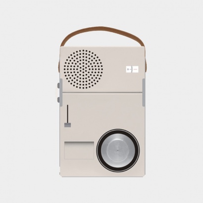
Good design makes a product useful
A product is bought to be used. It has to satisfy certain criteria, not only functional, but also psychological and aesthetic. Good design emphasises the usefulness of a product whilst disregarding anything that could possibly detract from it.
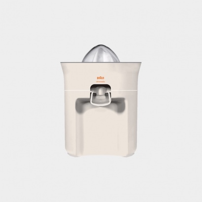
Good design is aesthetic
The aesthetic quality of a product is integral to its usefulness because products we use every day affect our person and our well-being. But only well-executed objects can be beautiful.
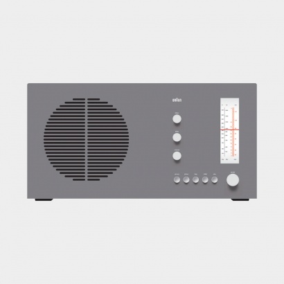
Good design makes a product understandable
It clarifies the product’s structure. Better still, it can make the product talk. At best, it is self-explanatory.
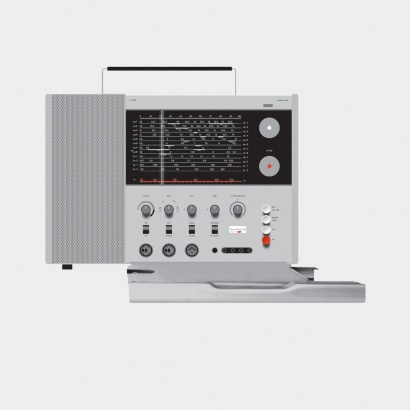
Good design is unobtrusive
Products fulfilling a purpose are like tools. They are neither decorative objects nor works of art. Their design should therefore be both neutral and restrained, to leave room for the user’s self-expression.
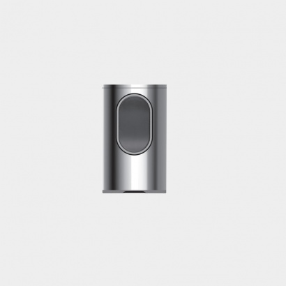
Good design is honest
It does not make a product more innovative, powerful or valuable than it really is. It does not attempt to manipulate the consumer with promises that cannot be kept.
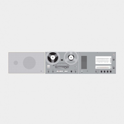
Good design is long-lasting
It avoids being fashionable and therefore never appears antiquated. Unlike fashionable design, it lasts many years – even in today’s throwaway society.
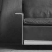
Good design is thorough down to the last detail
Nothing must be arbitrary or left to chance. Care and accuracy in the design process show respect towards the user.
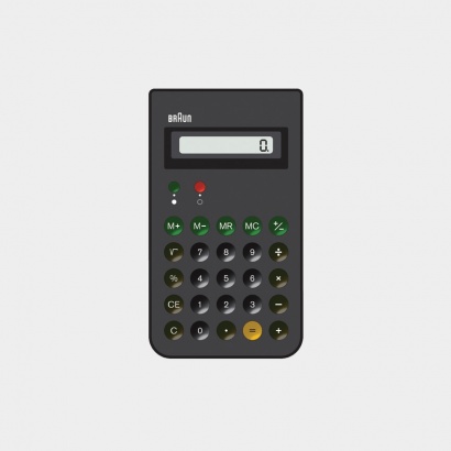
Good design is environmentally-friendly
Design makes an important contribution to the preservation of the environment. It conserves resources and minimises physical and visual pollution throughout the lifecycle of the product.
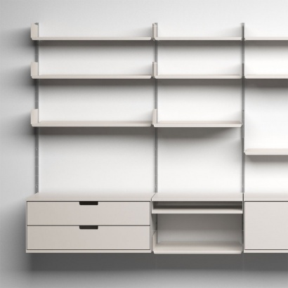
Good design is as little design as possible
Less, but better – because it concentrates on the essential aspects, and the products are not burdened with non-essentials.
Back to purity, back to simplicity.
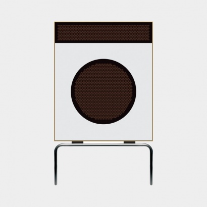
What Do You Think About "BAD DESIGN"?
Bad designs aren’t just something not pleasing to look at. Things that degrade user experience are bad designs. At best, bad designs do not help the user’s cause; at worst, they hinder their cause by creating obstacles for the user to climb over.
Good designs, on the other hand, don’t have to be something very clever. Often, the simplest tools have the best designs. In fact, sometimes designs which try to be too clever can be detrimental to user experience.
Here are some examples of bad design in everyday objects.
Serial Wired Fairy Lights
If you’ve ever been in charge of putting up Diwali or Christmas lights, you’ll know what I mean when say serial-wired lights are a right pain in the posterior.
All kinds of fairy lights are horribly difficult to untangle without damaging the delicate circuitry, but if a single bulb in a serial-wired string of fairy lights fuses, you are doomed.
When one bulb goes out, it breaks the entire circuit, and you have no way of finding out which one to change. That is, unless you are ready to take up the daunting task of checking every bulb by trial and error. If you have ever tried doing that, I salute your determination!
ATMs That Return Cards After Dispensing Cash
People visit ATMs for one purpose: withdrawing cash. Once the cash has been dispensed, they are in a hurry to leave. So, people are more likely to forget their cards at the ATM while using such machines.
Or there are some people who have minor anxiety attacks worrying about whether or not their card will get jammed in the dispenser. Either way, it’s horribly inconvenient!
Microwaves
Every microwave I’ve ever seen has at least a dozen more buttons than required. Why? Do the manufacturers believe more buttons will make their product look more high-end?
Be honest, do you use all the buttons on your microwave? Ever?
These Pencils!
I used to love these in primary school… until I began using one regularly.
If you lose ONE SINGLE BULLET (capsule?) in there, you’re screwed. And forget about being able to keep track of that little cap for the eraser after your first day of using the pencil.
Most Umbrellas
It’s this thing you hold that protects only your head and shoulders from getting wet. The rest of your body will get rain on it, do not let anyone fool you into believing otherwise.
Also, have you seen Mumbai rains? You always need to replace your umbrella before the season is out. Sometimes twice! It’s high time someone figured out a replacement for umbrellas.
Ordinary TV Interfaces
It is 2017, but the way we do television today is downright ancient. All television remotes have a lag. If you’re lucky, it’s a very short lag, but it’s still longer than you would tolerate on any other device. We tolerate it with television remotes because we’re used to it.
Also, there’s no search function in the guide! I might be ready to pay for a movie on demand if I could just search for it rather than having to scroll through a couple hundred options.
Even if there is a search function, the keyboard on the remote is still medieval rather than the QWERTY we use on all other devices.
Hand-held Shopping Baskets
Since the handle is in the middle, there is no way to hold the basket so that you can walk comfortably without letting stuff fall out!
USB Ports
I don’t know about you, but I can rarely plug in a male USB into my laptop on the first try. Usually, I have to flip that thing around thrice before it’ll go in! Also, it fits easily into the Ethernet port, which is usually right next to the USB port.
Sure, I can check if the little USB symbol aligns with the one on my device, but ain’t nobody got time for that!
Hydrating Creams in Big Plastic Bottles

I understand that some companies nowadays are not necessarily concerned with producing products that are durable, but the fact that you pay for a whole bottle of hydrating cream and can only access half of it because the packaging is badly thought of drives me crazy.
The cream I used as an example is not the only one that we have to cut open, in order to get the product that remains on the bottom of the container.
This product is designed to shorten the purchasing cycle, as you will think you have already finished your cream when in reality there is still much more left.
It is certainly not sustainable nor honest.
Supermarket Cashier

Every time I go to a supermarket and the moment to take my groceries to the cashier arrives, I have a mini panic attack. Independent of how much you have bought, it seems that you enter a speed competition to pack everything as fast as possible and leave without complaints.
Some supermarkets have already added the cashier on the picture where there is a separation in the middle in case you would are taking your time to pack, but as soon as the next spot is full by the next client, I start to worry.
I would love that someone would come up with a solution to pay for groceries in a different way so that the checkout process stops being so stressful.
Hope you all enjoyed by reading this good designs vs bad designs content blog!🤩
I’m sure there are many more examples of good designs and bad designs we have adapted ourselves to. Have you ever used something that made you want to pull your hair out?
Feel free to share your experience with us in the comments! ✍️💬
Keep in touch with me!📥🤩
Follow on Instagram👉Click here
Follow on LinkedIn👉Click here
Follow on Telegram👉Click here


Awesome dude. It's helps us more about designing
ReplyDeleteThank you so much Dude! :)
DeleteIt's very well understand for me... thank u for your detailed and cleared explanations.
ReplyDeleteThank you so much for your comment! :)
DeleteIt's help ful about design ,great job
ReplyDeleteThank you so much💐
Delete